Portfolio
Ripley Cleghorn
I am a visual storyteller, specializing in data visualization. My goal is to make data accessible, intuitive and engaging through narrative and design.I have an undergraduate degree in mathematics. In 2021 I completed an MS in data visualization at Parsons School of Design. I currently work as a data visualization designer for the Center on Rural Innovation. Previously, I was the news graphics intern at Scientific American.
Scientific American


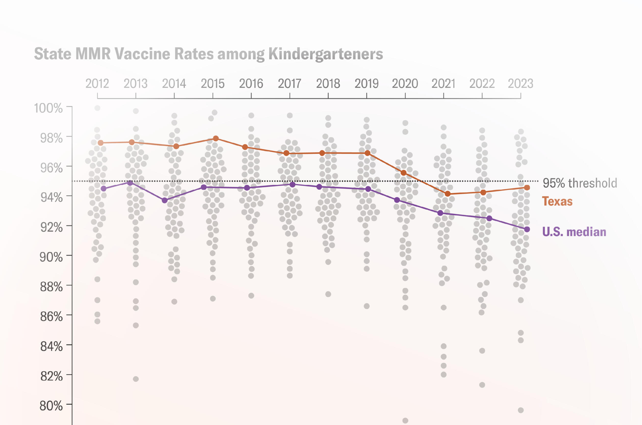
Measles, Through Charts
I reported on the measles outbreak in Texas and created a series of visualizations showing trends in measles vaccine rates.Featured in Visualising Data's newsletter:
"Some smart analysis and visuals"
I reported and visualized some of the effects of California's Proposition 65. You can see the digital version here

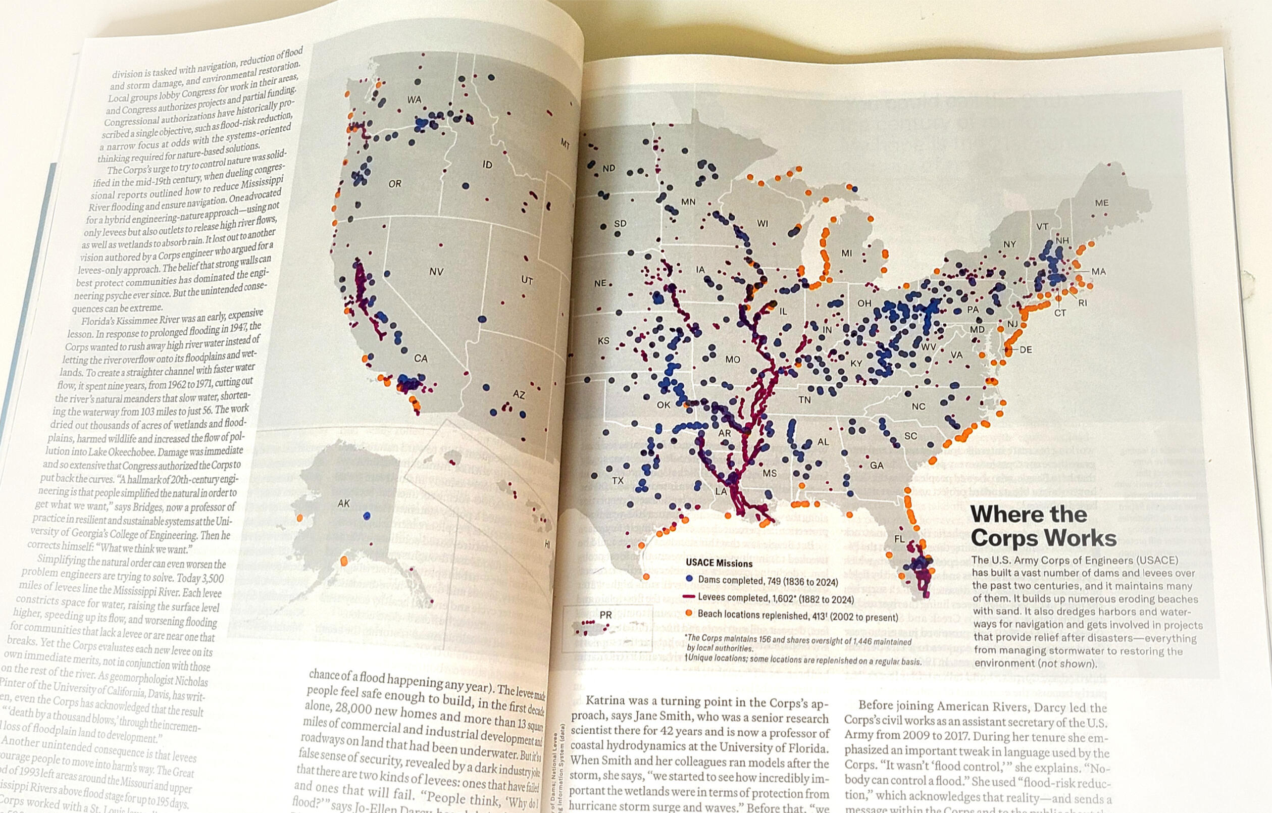
Army Corps Works
I compiled data and mapped where the US Army Corps of Engineers works, as part of a feature on how they are changing their approach to managing nature.
Other articles I've contributed graphics to:
Market Research

Master's
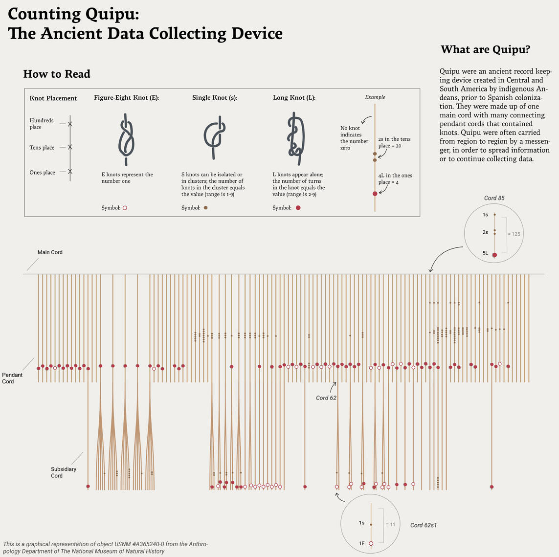
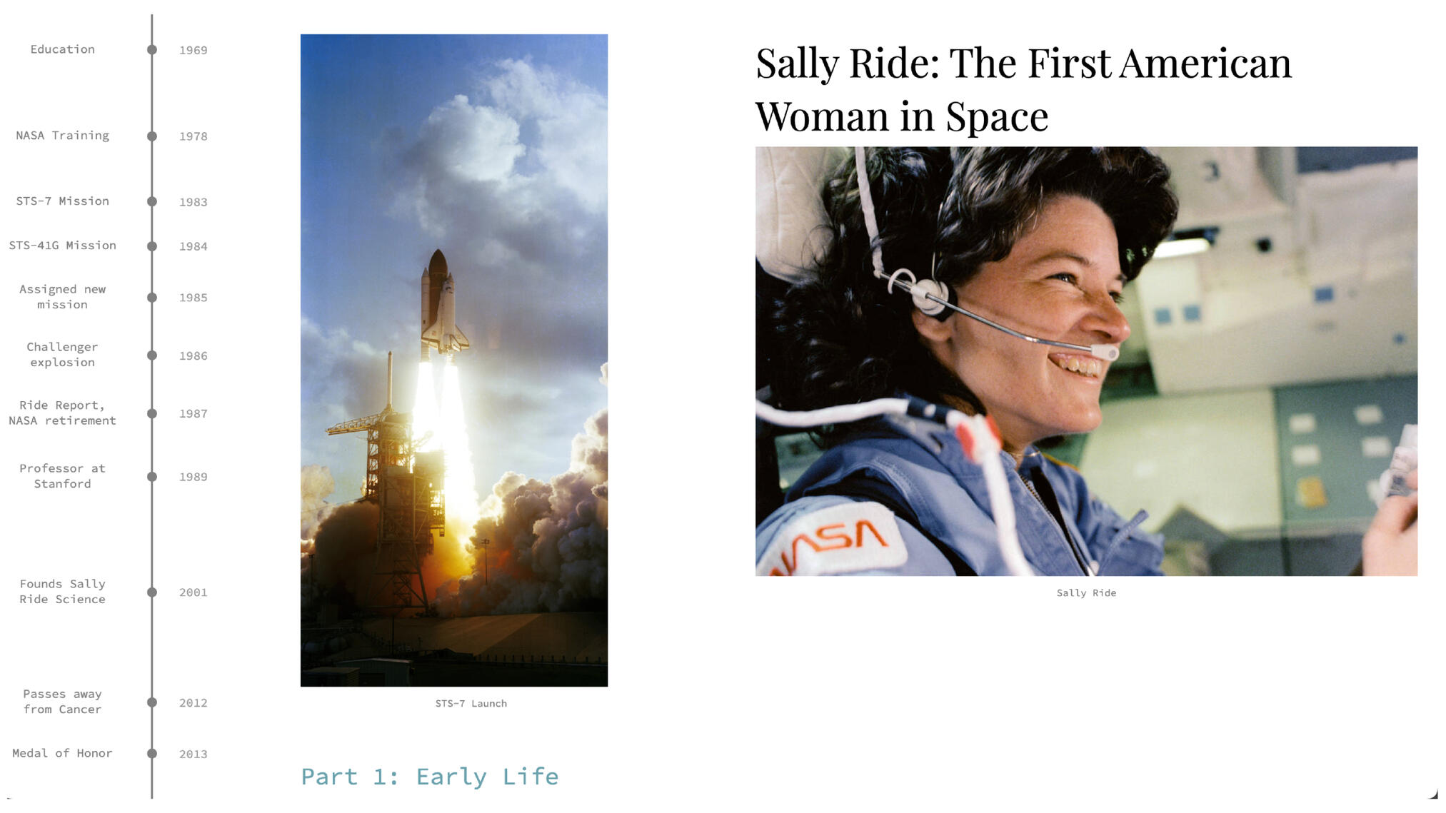
Images are linked to interactive projects
Let's get in touch
Please reach out with questions or opportunities for collaboration—or just to chat!